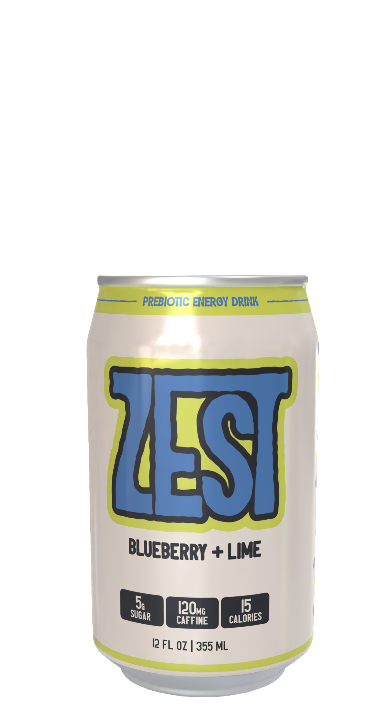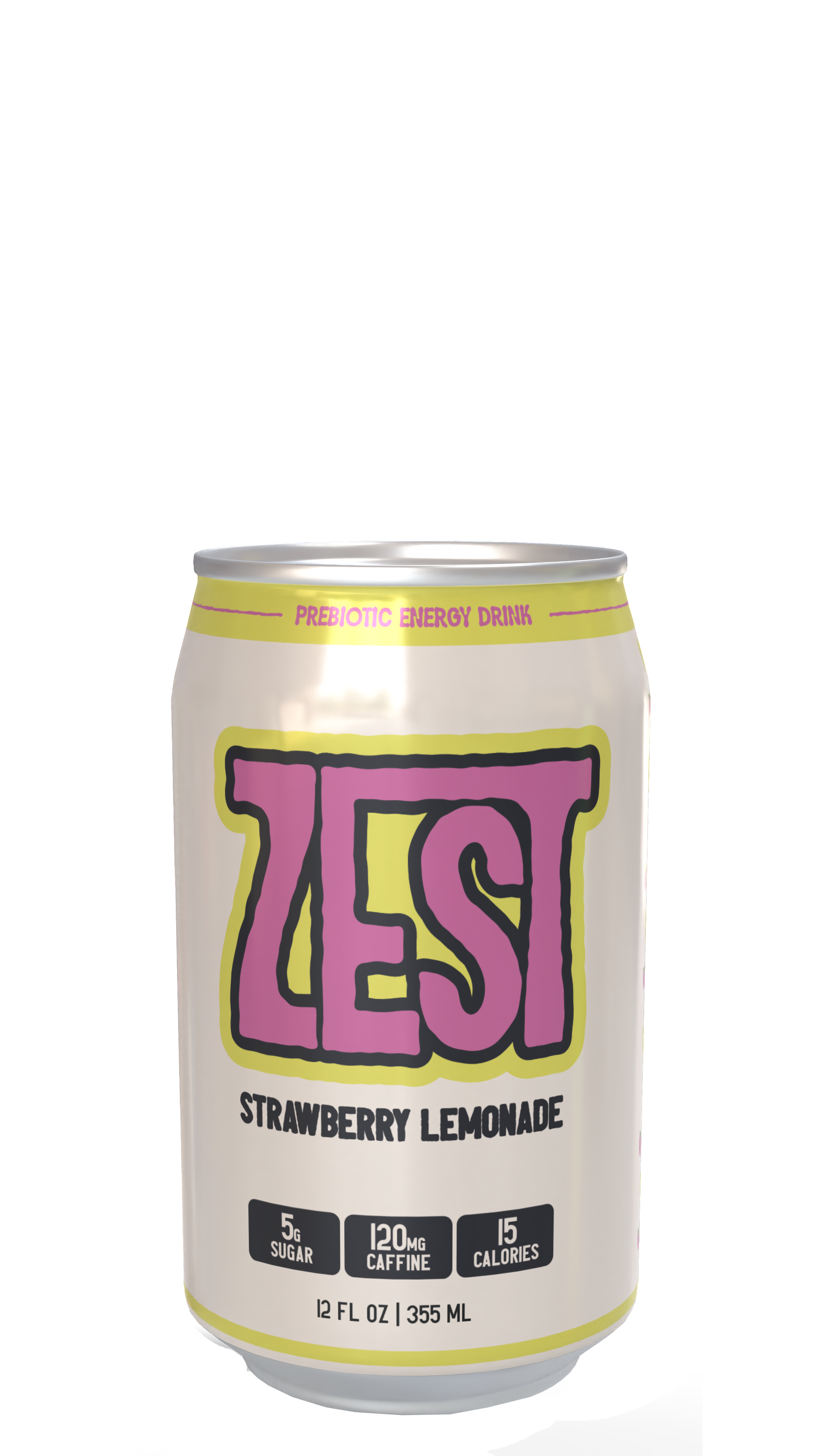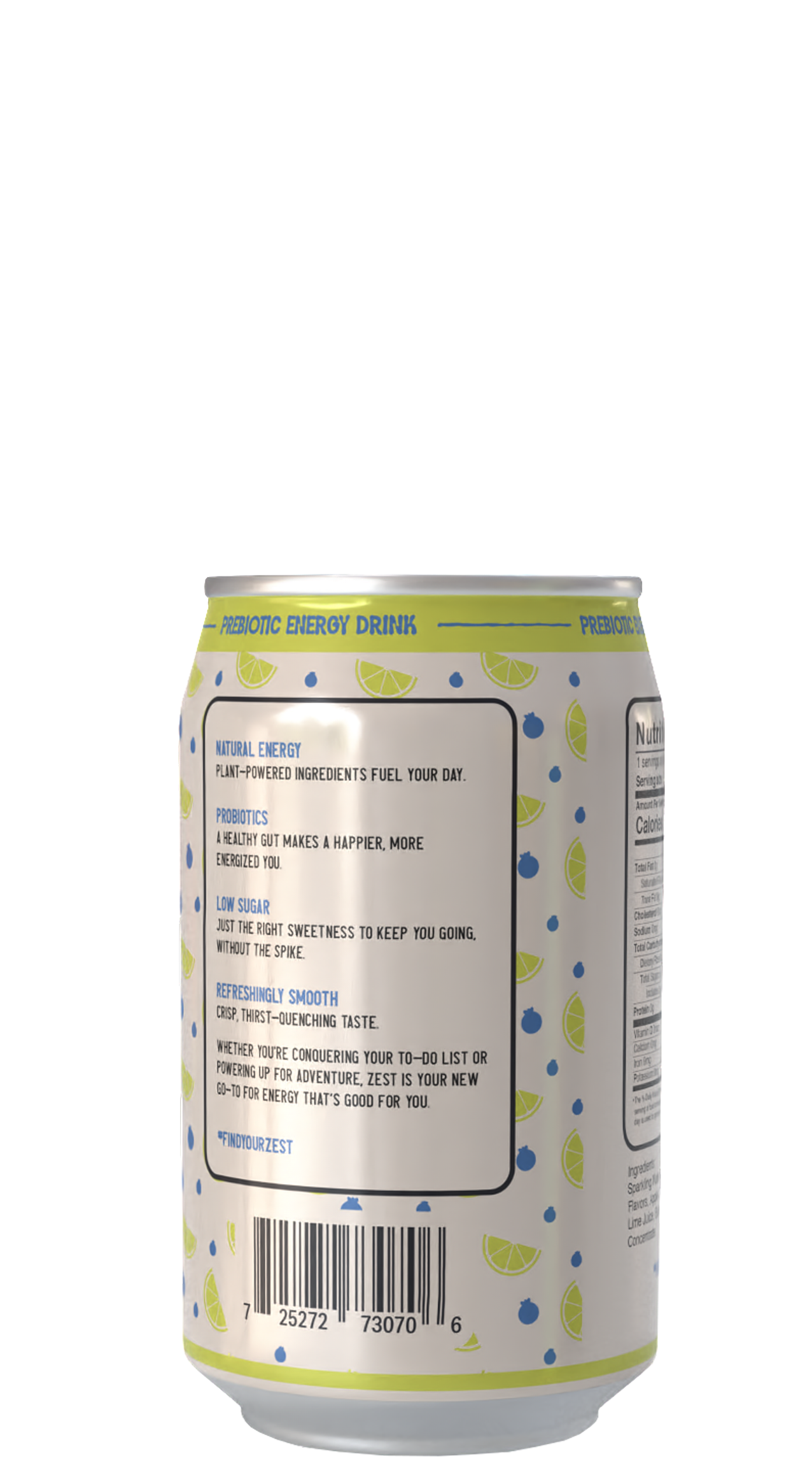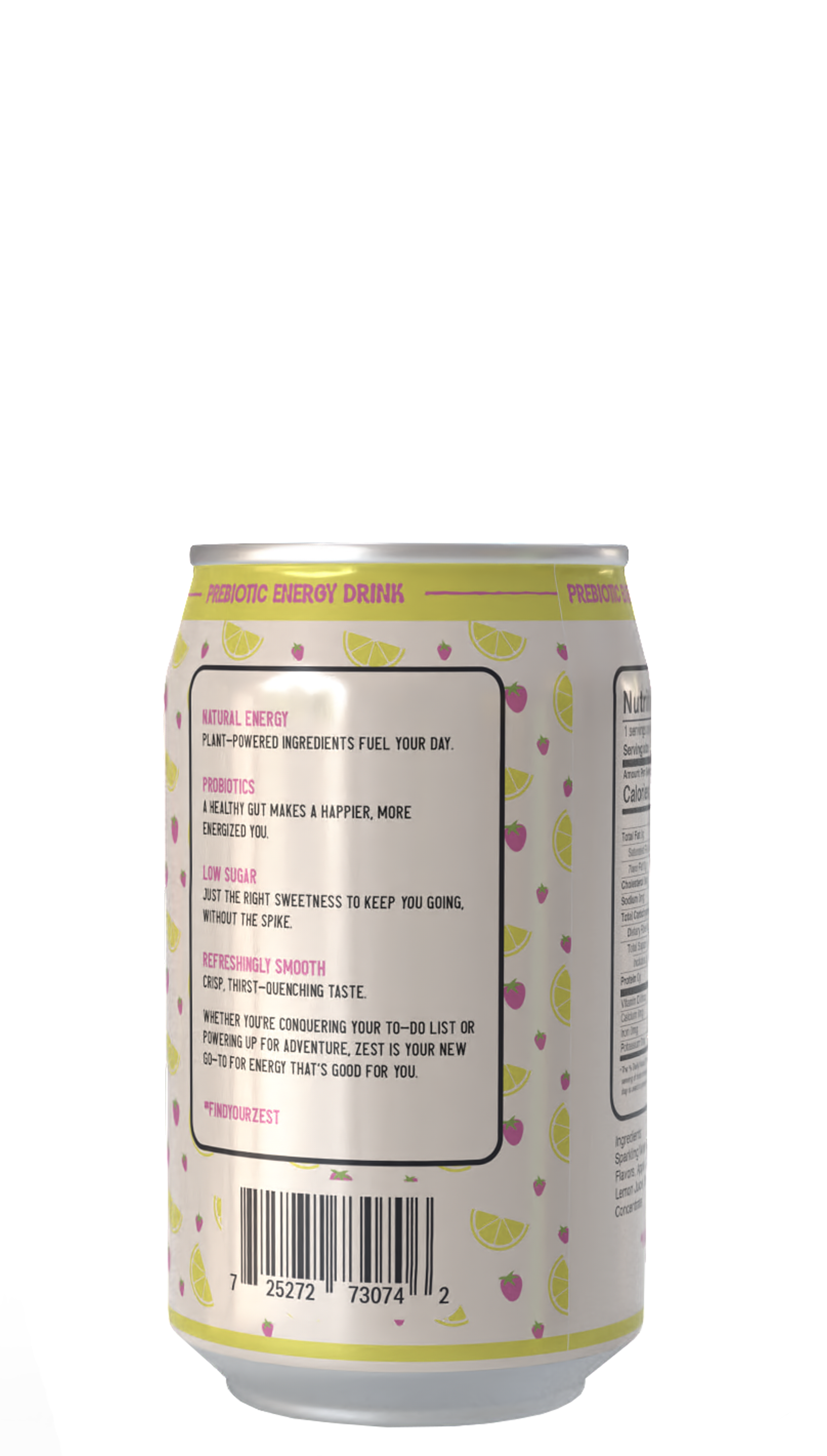


The goal of this project was to capture the liveliness and energy of the product while clearly communicating its health value and low-sugar profile. This packaging needed to appeal to consumers who seek a refreshing, natural energy boost without compromising on taste or excitement.
Design Theme
Bright and Bold Colors: Using bright, contrasting colors help each flavor pop while reinforcing a fresh, fruity experience, while keeping the design grounded with a muted beige and dark navy.
Typography: The typography is bold with organic elements. The “ZEST” logo has a rough, imperfect outline to evoke a sense of energy and movement. The font choices throughout the label are modern and easy to read, with a slight retro touch giving it a unique personality. The typography strikes a balance between playful and functional, aligning with Zest’s mission of being both a fun and health-conscious energy drink option.
Patterns: The background pattern features small, playful illustrations of the main fruit flavors. This pattern adds a layer of texture and reinforces the natural flavors in a way that’s visually engaging but not overwhelming.
Packaging Structure
The packaging is a standard 12 oz can, chosen for its convenience and compatibility with energy drink expectations. The wrap-around label includes key information prominently, with nutrition facts, ingredient lists, and flavor descriptions positioned for easy readability.
Demographic
Primary Target Young adults and active, health-minded individuals aged 18–35 who are looking for clean, sustainable energy sources to fuel their busy lives. This demographic values transparency, natural ingredients, and a refreshing taste in their beverages. They’re looking for something beyond the usual sugary energy drinks—a drink that’s as fun and vibrant as they are, but also fits into a balanced lifestyle.
