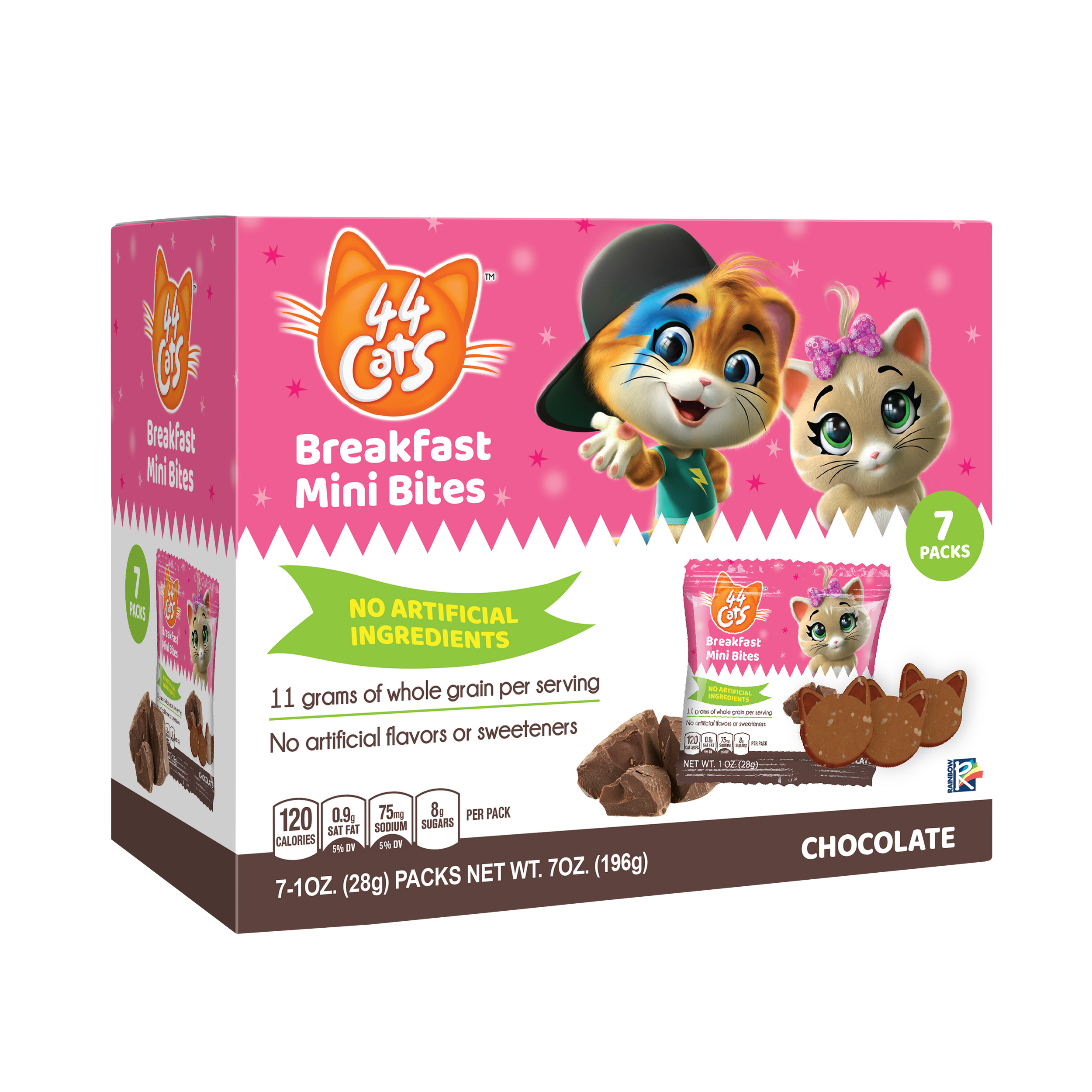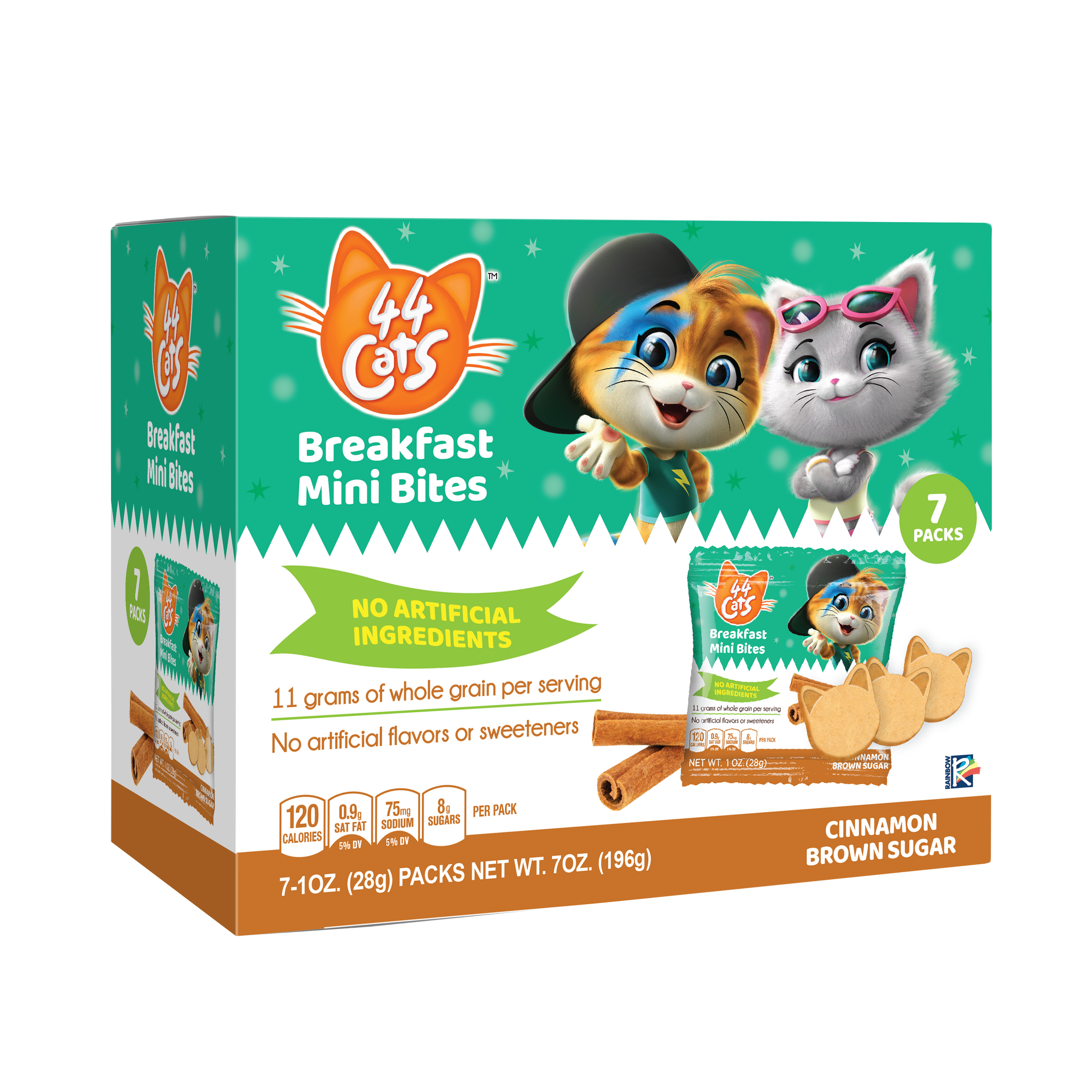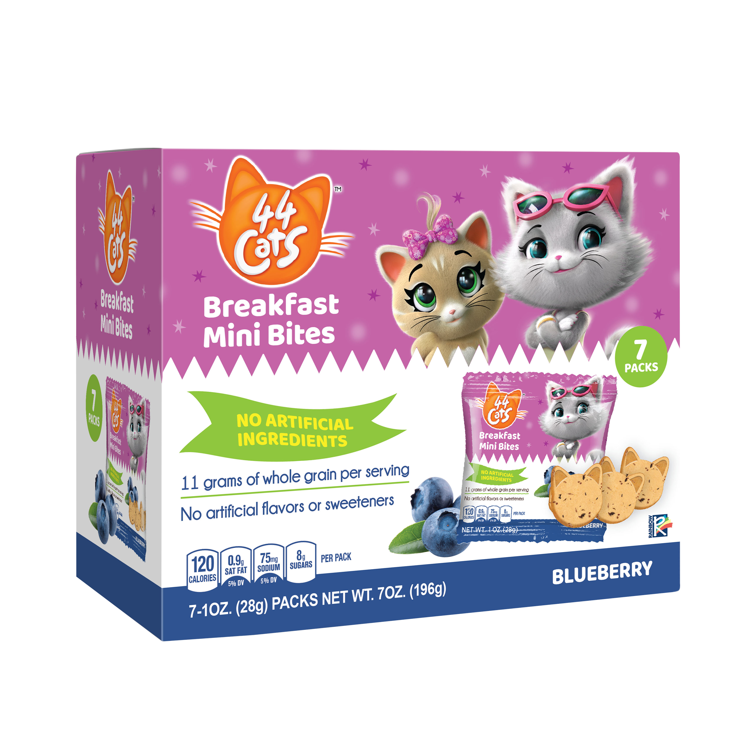


The goal Was to capture the attention of both young fans and parents, positioning the product as a wholesome and enjoyable start to the day.
Design Theme
Character-Centric Design: Featuring the main characters from 44 Cats in a way that brings their unique personalities to life.
Bright and Bold Colors: Using a lively color palette that reflects the cheerful and energetic vibe of the show, with colors that pop on the shelf.
Healthy & Fun Messaging: Clearly convey that the product is a nutritious breakfast choice. Integrated playful icons to emphasize health and taste.
Packaging Structure
Front Design: Display of the characters prominently, engaging children while informing parents of the product’s health benefits.
Clear Portions and Nutritional Benefits: Include visible, easy-to-read icons or small illustrations that highlight key nutritional values: “No Artificial Ingredients.”
Demographic
Primary Target Young children ages 5 to 8 years old. Therefore, the packaging design incorporates a balance of engaging visuals and functional simplicity, making it appealing for children.
Secondary Target Parents and caregivers, who appreciate convenience, product transparency, and familiarity with the 44 Cats brand.
