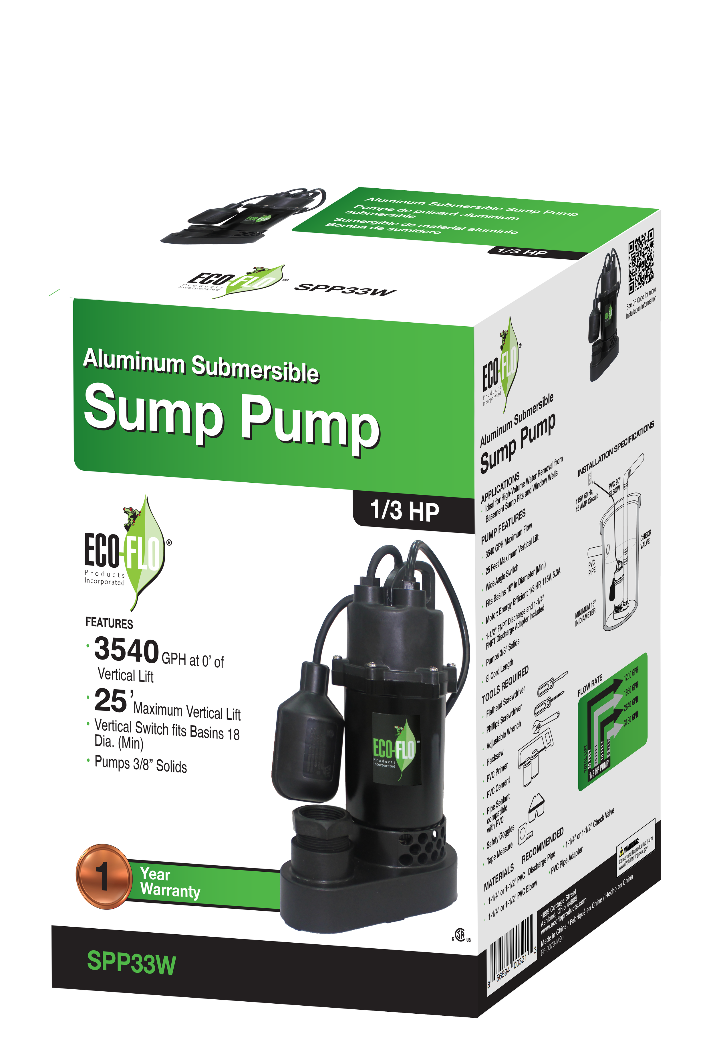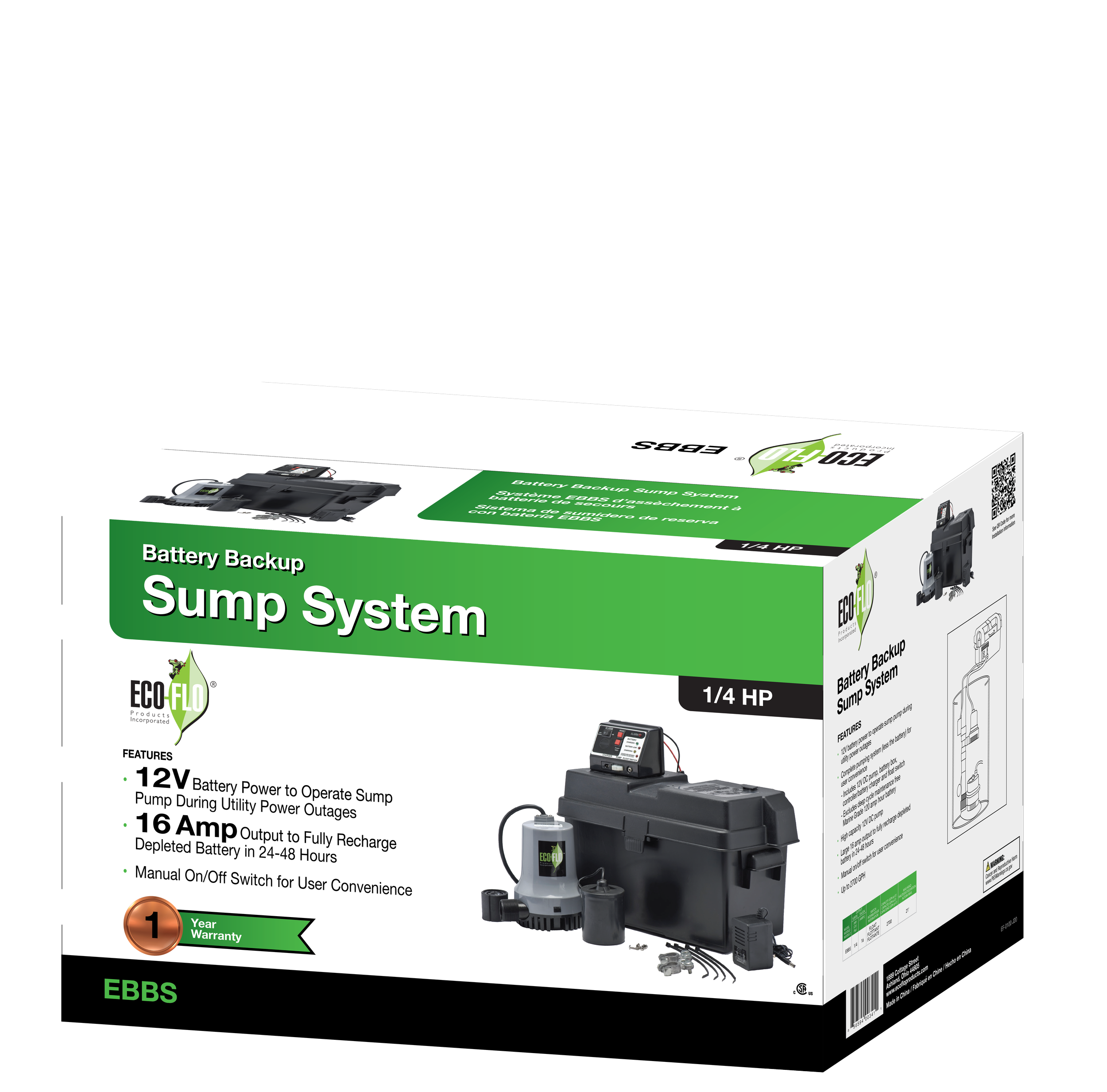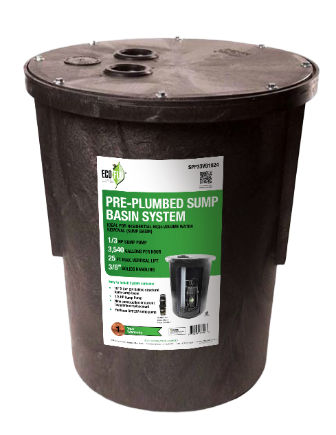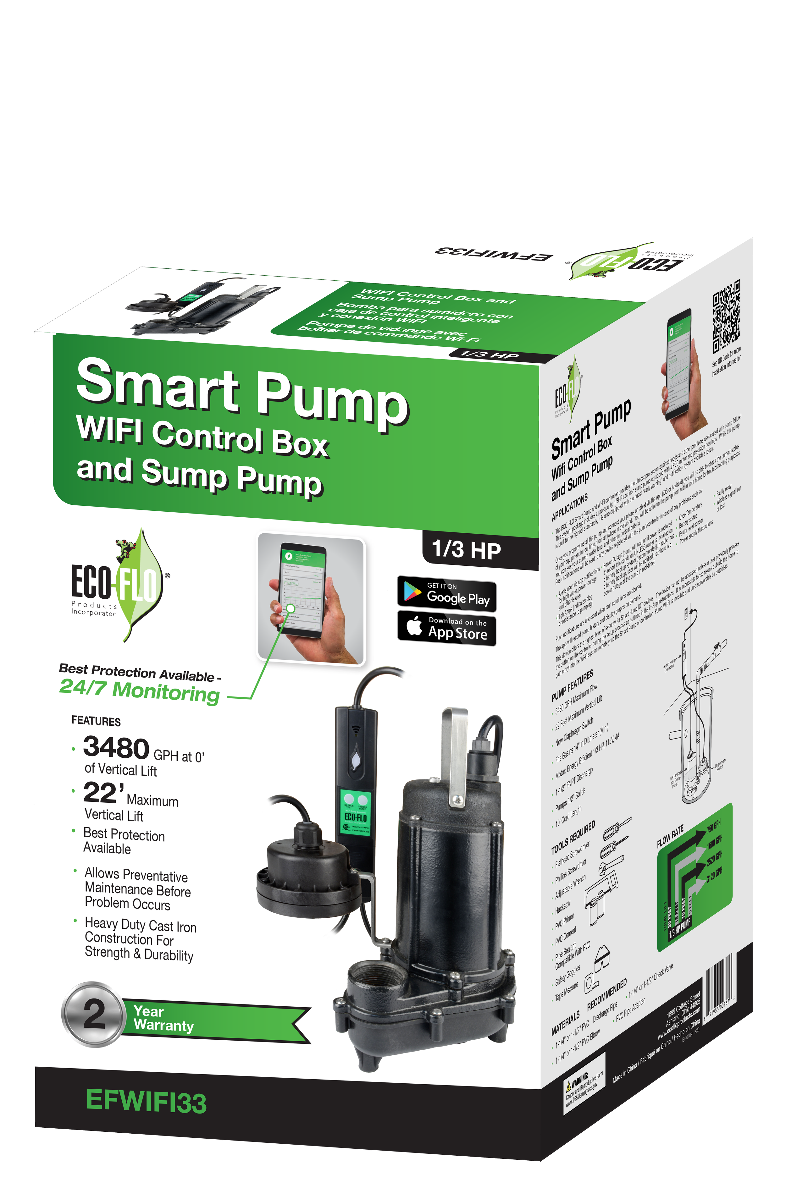


The goal of the packaging design for ECO-FLO Sump pumps was to create a clean, informative, and professional presentation that effectively communicates key product features, making it easy for customers to understand the pump’s capabilities at a glance.
Design Theme
Functional Design the design theme is minimalistic and straightforward, focusing on functionality and clarity. The overall aesthetic is crisp and efficient, appealing to practical, solution-oriented customers.
Enhanced Usability: A high-contrast layout with bold text and clear sections highlights the essential specifications to be seen at a glance or in a hurry, such as horsepower (HP), flow rate (GPH), vertical lift, and warranty. Technical information is clearly organized, with feature icons and specifications displayed in bullet points for quick reading.
Packaging Structure
Front: The front panel includes a large image of the pump, allowing customers to visually identify the product and its materials, with the Eco-Flo logo positioned prominently to build brand recognition.
Side: The side panels contain additional product information, diagrams, and a QR code for accessing further details, giving customers a thorough understanding of the product’s applications and included components
Demographic
The primary demographic is homeowners, DIY enthusiasts, and small business owners who require reliable, high-performance utility pumps. The clear labeling and technical information also cater to contractors, handymen, and other professionals who need to quickly assess a pump’s capabilities. This audience values quality, durability, and straightforward functionality, and the packaging reflects these priorities by focusing on clarity and practical design.
